
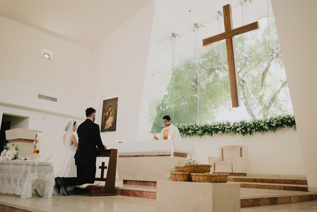
Black and white wedding photography is not a style choice you make in Lightroom at 2 a.m. on delivery night. It is a framing decision that begins in the viewfinder — which frames you shot with monochrome in mind — and a portfolio decision that shapes how couples find you. This guide covers when black and white wedding photography elevates a frame, when it flattens one, the editing workflow that produces consistent results, and how to balance the final gallery so the couple gets both.
TL;DR for black and white wedding photography
- Black and white wins where emotion, contrast, or composition carries the frame: crying parents, dancefloor candids, architectural ceremonies.
- Color wins where color is the point: flowers, food, golden hour, cultural attire, reception uplighting.
- Best galleries are mixed — plan a 70/30 or 80/20 color-to-monochrome ratio rather than an all-or-nothing delivery.
- Shoot with monochrome in mind (watch contrast, ignore color harmony), convert in post with intent, not as a salvage move.
- A dedicated black and white wedding photography portfolio page attracts editorial-leaning couples and publications.
When monochrome elevates a frame
Black and white wedding photography earns its place when the emotional or compositional content of the frame is already doing the heavy lifting and color would distract. Four scenarios show up repeatedly across strong wedding galleries.
Peak emotional moments. A parent wiping a tear during the ceremony, the groom’s face the second the bride walks in, the couple’s first private moment after the recessional. Skin tone, distracting background colors, and inconsistent light all fall away when the frame is monochrome. The viewer looks at the face.
Documentary candids on the dancefloor. Mixed club lighting, DJ color washes, and skin tones under red and blue gels are almost impossible to edit cleanly in color. Converted to black and white, the same frames become timeless. Many documentary-leaning wedding photographers convert 50 percent or more of their reception candids.
Architectural ceremonies. A cathedral interior, a historic chapel, a modernist concrete venue — geometry, shadow, and scale read more cleanly without color. The couple stands in relief against the space.
Harsh or mixed light. Fluorescent rental tents, sodium-vapor street lights during a send-off, any situation where the white balance fight is not winnable. Monochrome sidesteps the problem entirely.
When color is the better choice
Color is the right call when the color itself is the subject. Florals, especially bespoke bouquets and installations the couple paid for. Cultural attire — a red Chinese gown, a saffron sari, a tartan kilt — where the color carries cultural meaning. Golden hour portraits where the warm light is the photo. Reception details: cakes, tablescapes, signature cocktails, uplighting designed by a planner.
Color also wins when the story of the frame depends on setting: a vineyard at harvest, a garden in peak bloom, a beach at blue hour. Strip the color and you strip the location.
A test that rarely fails: imagine both versions. If the monochrome version makes you feel more, deliver monochrome. If you miss the color, it was the point.
Shooting with monochrome in mind
Photographers who consistently deliver strong black and white work shoot differently during the parts of the day they expect to convert. Three practical adjustments:
Watch tonal separation, not color harmony. A red dress on a green lawn is eye-catching in color and a grey blob in monochrome. Look for light-dark separation. Position subjects so a bright face reads against a darker background, or vice versa.
Use your camera’s monochrome preview. Most mirrorless bodies let you shoot with a black-and-white picture profile while recording RAW in color. You see the conversion in the EVF, adjust composition, and still have color data at home.
Embrace contrast. The frames that hold up in monochrome usually have more contrast than you would accept in a color delivery. Side-lit faces, backlit veils, silhouettes — scenes that feel almost too dramatic in color often resolve beautifully in black and white.
The editing workflow
RAW conversion approach
Always convert from color RAW, never shoot JPEG monochrome for hero frames. Working from the color file gives you channel control in post — you can darken blue skies, brighten red lipstick, separate skin from a similar-toned wall. Shooting JPEG monochrome locks you out of that latitude.
In Lightroom or Capture One, use the B&W mix (or monochrome panel in Capture One) rather than a global desaturation. The eight-channel mixer is where a black and white wedding photography workflow earns consistency.
Contrast and tone
Most wedding monochrome benefits from slightly deeper blacks than a color edit would use, with controlled highlights and a gentle S-curve through the midtones. Avoid crushing shadows globally — detail in a wedding dress or a suit jacket is what separates editorial black and white from an Instagram filter.
Film emulation presets are a legitimate starting point if treated as a starting point. Tri-X, HP5, and Ilford Delta looks are common references. Our notes on evaluating wedding presets apply directly — test on a mixed set of frames, not a single hero.
Consistency across the gallery
A gallery with 40 monochrome frames that each have a slightly different contrast and tonality reads amateur. Establish a base conversion (your starting point) and apply it across the set, then adjust per frame within a narrow band. The approach mirrors the color-consistency discipline applied in color grading for weddings.
Portfolio and marketing decisions
Black and white wedding photography attracts a specific couple. They tend to skew editorial, often describe their taste as timeless or documentary, and follow photographers whose Instagram grids lean monochrome. If you want that work, the portfolio has to show it.
A few options:
Dedicated portfolio section. A “Black and White” or “Film” category on the site that curates 40 to 80 of your strongest monochrome frames. This becomes the entry point for editorial-leaning inquiries and a useful page for portfolio building reference.
Mixed galleries on blog posts. Each wedding blog post includes 5 to 10 monochrome frames interspersed with color. This shows couples what their real gallery will look like, not an all-or-nothing extreme.
Publications that favor black and white. A subset of wedding editorials prefers monochrome-heavy submissions — Magnolia Rouge, some indie film-leaning titles. Knowing which publication favors which style is part of a working submissions strategy.
How to split the final delivery
Clients rarely ask for “all black and white” or “all color.” They want both, and they want the photographer to decide. A practical split for a full-day wedding:
| Section | Suggested ratio | Why |
|---|---|---|
| Details (rings, dress, florals) | 90% color | Color is the point |
| Getting ready | 70% color, 30% B&W | Documentary moments convert well |
| Ceremony | 60% color, 40% B&W | Emotional peaks shine monochrome |
| Portraits | 80% color, 20% B&W | Couple usually wants color of their attire |
| Reception candids | 40% color, 60% B&W | Mixed light favors monochrome |
| Dancefloor | 30% color, 70% B&W | Color washes rarely render cleanly |
A 600-frame gallery built this way lands around 70 percent color and 30 percent black and white, which matches what most documentary-leaning couples report as their preferred ratio.
Pitfalls worth flagging
Delivering a color and a monochrome version of the same frame inflates galleries and signals indecision. Pick one version per frame. The exception is a single hero the couple specifically requested both ways.
Heavy grain is a stylistic choice, not a default. Grain-heavy film emulation suits some photographers; others deliver cleaner conversions that hold up at wall-print scale. Pick the direction and stay consistent.
Oversaturated blacks and hot whites read as over-processed. A light-meter histogram that still shows detail in both ends is a better target than the “punchy” look that Instagram rewards.
Where couples find black-and-white-leaning photographers
A wedding photographer directory with style filters is the fastest path. Couples also find editorial-leaning shooters through publications and through the wedding photography styles compared framework — reportage, editorial, and film-influenced photographers convert the highest percentage of monochrome frames.
Done with intent, black and white wedding photography gives a wedding gallery something color alone cannot: distance from the trends of 2026 so the images still hold up in 2046. That is the real argument for monochrome, and it is the reason the best wedding galleries have always had some.